Branding
Born Out Of Waste
BOW is a sustainable furniture brand, short for Born Out of Waste. All the pieces are crafted from the leftover materials generated by its parent brand, following a true zero-waste approach.
Year :
2023
Industry :
Furtniture
Client :
Furnitech
Project Duration :
2 weeks

About :
BOW, short for Born Out of Waste, is a sustainable furniture brand built on a simple idea: giving discarded materials a new life. Every product, whether furniture or décor, is thoughtfully crafted using waste generated by the parent brand, Furnitech. By transforming these offcuts into functional, beautiful pieces, BOW stays true to its promise of a genuine zero-waste process.
*Project ownership rights belong to one2one studios*

Conceptualisation :
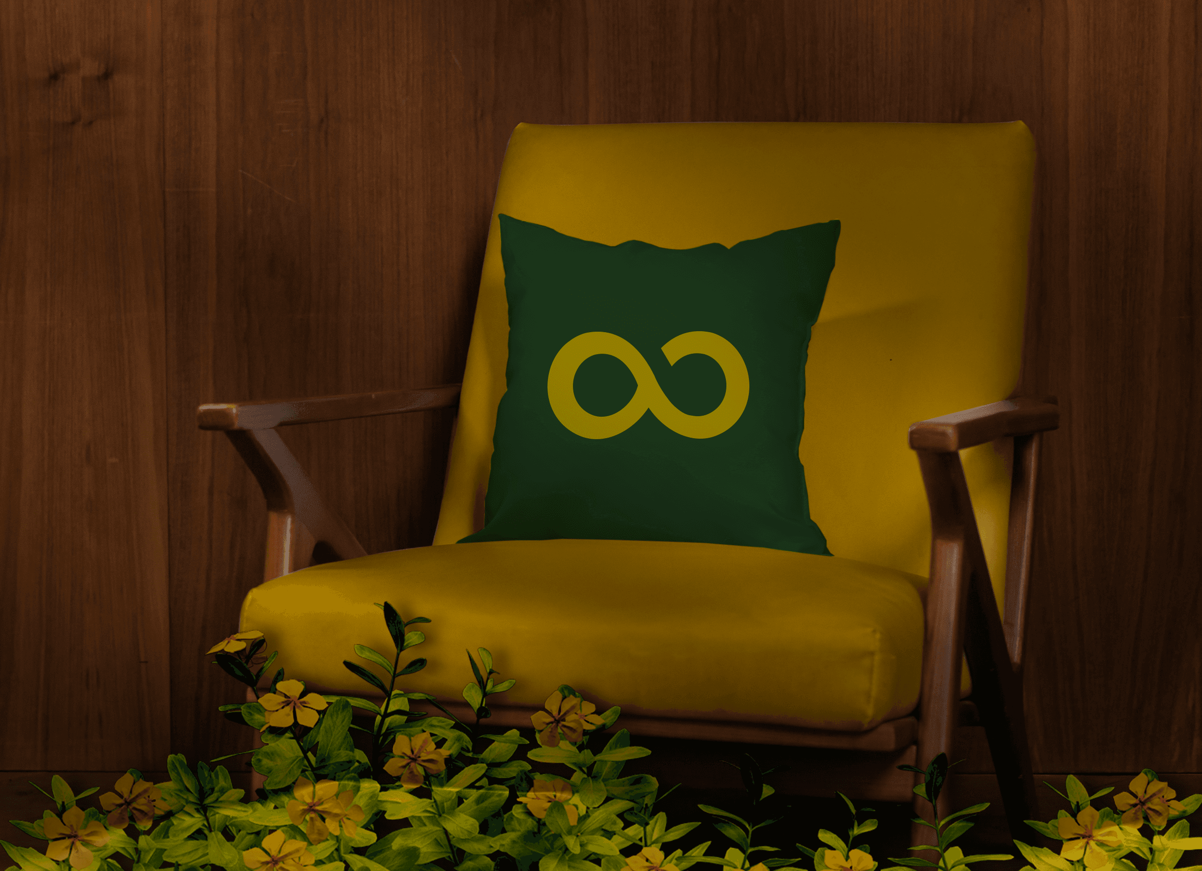
Rooted in the principles of Reduce, Reuse, Recycle, the brand identity draws inspiration from its core values. The letters ‘b’ and ‘o’ are seamlessly merged to form an infinity symbol, representing the continuous cycle of using and reusing waste materials to create sustainable products.


Visual Identity Design :
The logotype follows a geometric style, its sharp edges represent the raw, unfinished nature of furniture waste, while the infinity form created by the two letters reflects the brand’s commitment to the three R’s.
Colour Palette :
The colour palette features shades of green and yellow, chosen to mirror the brand’s sustainable and eco-conscious foundation. Green reflects renewal, growth, and environmental responsibility, while yellow adds warmth and positivity, symbolising the optimism behind creating something new from waste.

More Projects


Branding
Born Out Of Waste
BOW is a sustainable furniture brand, short for Born Out of Waste. All the pieces are crafted from the leftover materials generated by its parent brand, following a true zero-waste approach.
Year :
2023
Industry :
Furtniture
Client :
Furnitech
Project Duration :
2 weeks
About :
BOW, short for Born Out of Waste, is a sustainable furniture brand built on a simple idea: giving discarded materials a new life. Every product, whether furniture or décor, is thoughtfully crafted using waste generated by the parent brand, Furnitech. By transforming these offcuts into functional, beautiful pieces, BOW stays true to its promise of a genuine zero-waste process.
*Project ownership rights belong to one2one studios*
Conceptualisation :
Rooted in the principles of Reduce, Reuse, Recycle, the brand identity draws inspiration from its core values. The letters ‘b’ and ‘o’ are seamlessly merged to form an infinity symbol, representing the continuous cycle of using and reusing waste materials to create sustainable products.
Visual Identity Design :
The logotype follows a geometric style, its sharp edges represent the raw, unfinished nature of furniture waste, while the infinity form created by the two letters reflects the brand’s commitment to the three R’s.
Colour Palette :
The colour palette features shades of green and yellow, chosen to mirror the brand’s sustainable and eco-conscious foundation. Green reflects renewal, growth, and environmental responsibility, while yellow adds warmth and positivity, symbolising the optimism behind creating something new from waste.
More Projects
Branding
Born Out Of Waste
BOW is a sustainable furniture brand, short for Born Out of Waste. All the pieces are crafted from the leftover materials generated by its parent brand, following a true zero-waste approach.
Year :
2023
Industry :
Furtniture
Client :
Furnitech
Project Duration :
2 weeks
About :
BOW, short for Born Out of Waste, is a sustainable furniture brand built on a simple idea: giving discarded materials a new life. Every product, whether furniture or décor, is thoughtfully crafted using waste generated by the parent brand, Furnitech. By transforming these offcuts into functional, beautiful pieces, BOW stays true to its promise of a genuine zero-waste process.
*Project ownership rights belong to one2one studios*
Conceptualisation :
Rooted in the principles of Reduce, Reuse, Recycle, the brand identity draws inspiration from its core values. The letters ‘b’ and ‘o’ are seamlessly merged to form an infinity symbol, representing the continuous cycle of using and reusing waste materials to create sustainable products.
Visual Identity Design :
The logotype follows a geometric style, its sharp edges represent the raw, unfinished nature of furniture waste, while the infinity form created by the two letters reflects the brand’s commitment to the three R’s.
Colour Palette :
The colour palette features shades of green and yellow, chosen to mirror the brand’s sustainable and eco-conscious foundation. Green reflects renewal, growth, and environmental responsibility, while yellow adds warmth and positivity, symbolising the optimism behind creating something new from waste.